One of the biggest design misconceptions is that it is easy to make a logo. To begin with, a logo is much more than just some colors, fancy fonts, and graphics put together. A logo is an essential part of a brand's visual identity.
Creating a logo demands critical thinking, creative input, and methodical planning. Simply put: you don't just sit down and create a logo while binge-watching your favorite Netflix show.
So, how do you make a logo worth remembering?
We've compiled 50 inputs – a combination of rules, tips, and tricks – on how to create an awesome logo. Read on, digest the guidelines, and put them in action.
Make sure to dive into our logo templates to help push your design along faster.
The Basics
1. Get inspired.
Inspiration that jumpstarts the flow of creative juices can come from anywhere. When creating a logo, the obvious sources of inspiration are design-centric websites like Logo Gala. Expand your research to other creative sites such as Dribbble or Deviant Art. Offline, observe your surroundings. Anything that makes you fired up or happy is a potential root of an awesome idea.
2. Learn anything and everything you can about logos.
An effective logo is unique, sensible, visually enticing, and delivers its intended message. In its basic form, a well-designed logo is a form of brand identity. However intricate or time-consuming the design process gets, the end product must always be simple to understand, memorable, enduring, versatile, and appropriate.
3. Develop your own creative process.
Every designer has his or her own approach, and it's almost never linear. However, a majority of them follow a general branding process. This consists of the following:
- Design brief - interviewing the client and making sure you get all the information you need.
- Research - learning more about the industry/niche, as well as the client's history and competition.
- Reference - checking out design inspiration related to what the client needs, as well as looking at the current design trends.
- Conceptualization - sketching and developing the logo around the given brief and the research you've made.
- Reflection - letting the idea mature following a quick design break.
- Presentation - choosing a couple of design options to show the client, as well as getting feedback and doing some edits until the design is complete.
4. Set up your price system accordingly.
“How much for this design?” is arguably one of the most frequently asked questions, especially during the briefing process. It’s also a question that’s hard to answer, since every client has different needs and requirements. You need to learn business skills – especially if you’re a freelancer – to price your work accordingly. Look into the different factors involved in designing a logo. These include the number of concepts to present, the number of revisions to make, the degree of research needed, and so on.
The best way to handle this business aspect is to draft a customized quote for every client. In doing so, you will learn how to put a financial value on your designs (which is a different topic altogether).
5. Learn from others.
By understanding how other brands made it to the top, you will get tremendous insights on logo-making as a whole. At one point or another, this awareness will you help you become better at what you do.
Tips and Tricks
6. Research your audience.
Designing a logo is not just about creating an appealing visual. Your main objective is to build up a brand. You also need to set up a communicating position between the company and its target audience. This is why market research is important. It's highly recommended to involve the client at this stage since your take on the brand may not be the same as theirs. It's critical that you’re 100% clear on the message before you start the creative process.
7. Throw yourself into the brand.
Ahead of doing logo sketches, invest some time compiling information about the client: who they are, what they do, how they work, and what their target market is. Study previous versions of their logo (if available), and think about the upgrades needed to fully represent the brand. Then, make a list of do’s and don’ts pertaining to what the client needs before you get the ball rolling.
8. Save all your sketches.
It's a common practice for designers to come up with a number of sketches for a single project. Even if you're able to pinpoint early on which sketch to develop, don’t discard the others as they can be valuable resources in the future. Just because the other sketches didn't work for one client doesn't mean they won't work for another. Revisit them whenever a new project comes in to find a seed of inspiration.
9. Research online.
If you're struggling with ideas or concepts, look up keywords associated with the brand online. You can also search through Google images for visual inspirations.
10. Create mind maps or mood boards.
These kinds of tools help filter the ideas in your head, and mix up various images and concepts. Work with keywords and word alternatives to accumulate a variety of inspiration using different sources. Place them in one giant mood board to see how they work together.
11. Build a board and tear it apart.
This is in connection with the tip above. Make a mood board of logos related to your project. Evaluate what made them effective. Afterward, tear the board apart and use your assessment as a guide to make your own unique creation.
12. Stop with the clichés.
Every couple of years or so, a new design fad enters the ballgame. Study the styles - you can even use some of them - but avoid jumping on the bandwagon if the “new” idea is basically just a rehash of an old one.
13. Make the design versatile.
Creating a versatile logo goes a long way in ensuring its longevity. If the logo looks great on posters but awful on novelty items, it can limit its popularity. Versatility plays a huge role on how you select the elements of your design - colors, fonts, layouts, and the likes.
14. Use a grid to produce a timeless design.
When it comes to designing – especially using traditional techniques – everything is about the grid. Case in point: the iconic logo of Shell Oil that hasn't changed much since its launch in 1971. When done right, the grid makes the design cohesive, put together, and timeless.
15. Use pen and paper.
Even with the techy sketching programs available online, sketching using pen and paper is still the best way to flesh out ideas. Sketching out ideas enables you to experiment freely. It prevents you from being swept up from the finer details.
It doesn't really matter if your sketching skills are poor. As long as they deliver your ideas correctly, you’re on the right track.
16. Construct vectors.
Right after sketching your ideas, proceed to the more technical aspect of design. The best way to save you time and frustration when you eventually edit your design is to create vectors. In this process, the Illustrator is your best friend as it can rescale your design without sacrificing its quality.
17. Decide on your fonts carefully.
Typography is certainly a key element to an effective logo. There are two main options for this: create a customized typeface or use a pre-set one. If you create your own typeface, avoid making it too trendy. Instead, keep it simple, readable, and classy.


18. Stay away from gimmicky typefaces.
This is in connection with the tip above. Avoid the temptation to make your logo shine by using gimmicky typefaces. The majority of gimmicky fonts are overtly fancy and excessively weak. If you're aiming for a professional yet unique look, avoid these fonts at all costs.
19. Use a maximum of two fonts.
Naturally, there will be exceptions to this rule. But, as a common principle, using just two fonts is smart if you want your design to be distinct, sharp, and clean.
20. Tell a story.
Every design has a story to tell, and logos are not an exception. If you see a logo as just an artwork or a structure of lines and texts, you won't be able to express the meaning behind it. Ideally, a powerful logo features two stories: one that is obvious and another that is hidden.
21. Consider the space around the logo.
Most brands require an exclusion zone, which is the area surrounding the logo that isn't meant to be filled by any other element. This space serves as a protection to the integrity of the logo. When designing, think about how the exclusion zone should be used.
22. Design an active logo.
If you use a device within the logo to facilitate it, think about adding some movement to it. This “movement” isn't about adding animations, but more of the size, placement, and rotation of parts within the design. For example, a fish will appear in motion if it's “caught” on a mid-jump. Additionally, you must take into consideration the direction of the intended motion.
23. Think of tones along with colors.
An effective logo works in black and white and in color. If your logo uses color to express a message, consider the best way to show its meaning when the color is taken off. At times, this requires altering the contrast between the various elements of the design so they still express the same message when modeled in monotones.
24. Keep up with trends.
Taking note of current logo trends doesn't suggest to mindlessly following them. But if you must break some rules to broaden your design options, to optimize a trend - or even start a new one - you must also know what you're up against.
25. Practice all the time.
If there’s only one thing you remember from this article, make it this rule.
Mistakes to Avoid
26. Underestimate the importance of a proper color scheme.
Colors make up the essence of any visual art. Quite often, designers disregard the value of the astute usage of colors. This is probably caused by the misunderstanding that a ‘clean’ design only involves white.
27. Fall into the cool, flashy creation trap.
Innovation is a marvelous thing. This is how you can find ways to work around what you have, try things out, and come up with killer ideas for your design. But, all things have its own share of rules and restraints. Your innovative capabilities are countless, but their practical uses aren’t. Excessive experimentation can produce a logo that is lovely to look at, but isn't identifiable with the brand itself.
28. Undervalue custom typography.
In terms of logo design, your fonts must be distinctive. A customized, hand-drawn typeface is more effective than most dazzling fonts easily available online. If nothing else, it can keep design plagiarists away. Also, custom lettering is more identifiable in a logo than a font downloaded off the internet.
29. Be easy to predict.
Your design won't stand out from the crowd if it looks the same as what's already out there. Aim to design a logo that is somewhat unfamiliar yet still relatable. It should suggest something: a story, a feeling, or an action.
30. Think of your designs as unparalleled.
While having confidence in your ability is good, putting yourself in the “best” category can hinder your growth. Your brilliance is as good as your last design. If you keep this in mind, you will strive harder to grow as a designer.
Premium Logo Tutorials
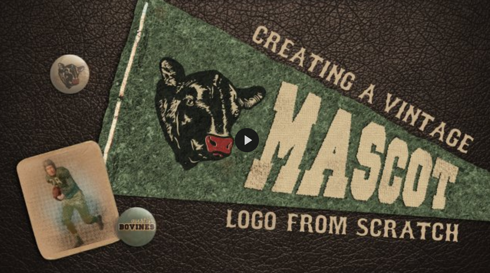
31. Logo Design: Creating a Vintage Mascot Logo from Scratch
This tutorial teaches you how to create a mascot logo from start to finish. It shows how to correctly structure a digital logo to be used for screen printing or embroidery. It also connects the design’s vintage vibe into modern design.
32. Logo Design Fundamentals: Simple and Solid Brand Marks
The instructor highlights how simplicity in logo design shouldn’t be underestimated. With basic shapes and colors, the tutorial teaches how to create a simple, yet strong, logo. It also imparts how to optimize communication with minimal and concise pieces of information.
33. Logo Design the Draplin Way: Building with Shape, Type, and Color
This tutorial that runs for over an hour shows how to make a family crest. It tackles the art of designing this personal logo – from background research and shape formation to font and color choices.
34. Logo Design Project Step by Step Walkthrough
This tutorial, as the name suggests, is a step-by-step documentation of creating a logo. It imparts tips, tricks, and guidelines from design conception to completion.
35. Logo Design Video Tutorial
The instructor recreates a video game logo using digital techniques every designer must learn. The video shows how to construct a grid background on an existing logo.
36. Creating an Environmentally Friendly Green Type Treatment
This class uses illustration to teach how to design logos using the Green type treatment. It also imparts tips and guidelines for eco-friendly treatments for other design elements.
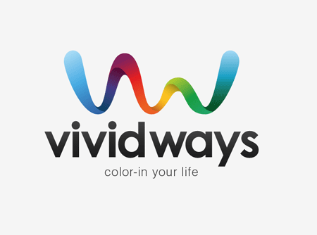
37. Logo Design Process and Walkthrough for Vivid Ways
Chris Spooner teaches us the techniques and tricks to finish off a logo design using Adobe Illustrator. It especially highlights font and color section to make a simple yet sophisticated end product.
38. Papercraft Text Effect
This tutorial helps you effortlessly make a customized logo using stunning text effects. It also lets users test their logos using different colors and fonts.
39. Wooden Text Effect in Photoshop
This class, often recommended by top designers, delves deeper on how effects and textures can be used for logo creation. It lists down techniques and tricks that are very clear and easy to follow.
40. Windows Vista Logo Photoshop Tutorial
This tutorial, as the name suggests, is all about creating the Windows Vista logo using Photoshop. It provides a step-by-step instruction on how to properly create the mirror and glossy effects of the logo.
41. How to Create a Vintage Badge Logo with Illustrator and Photoshop
The designer offers tips, tricks, and techniques on how to create awesome logos with a vintage or retro vibe. The tutorial uses Adobe Photoshop and Illustrator to create a 70s type logo.
42. How to Create the Volkswagen Logo
This tutorial demonstrates how to recreate the iconic Volkswagen symbol. It highlights several techniques like layer styling, radial gradients, and lasso selection to reconstruct the famous brand logo.
43. Cool Music Logo on a Grunge Background
The instructor teaches how to create a logo intended for websites with a grunge style background. The tutorial focuses on tricks and techniques to make this type of logo pop.
44. Create Rainbow Logos with Warped Grids
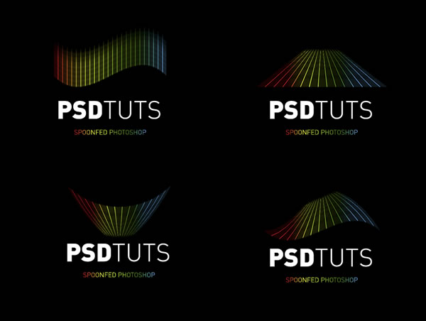
The tutorial tackles how to use Warped Grids to make a logo more dynamic and flexible. It provides a step-by-step instruction on creating rainbow logos using the easy yet versatile Warped Grids technique.
45. Glowing and Sparkling Intense Light 3D Logo
The instructor teaches how to design and create a glowing or sparkling intense light three-dimensional logo. The tutorial shows different techniques and tips to produce the desired effect.
46. Logo Presentation Tutorial
This tutorial teaches how to correctly present logotype. It underlines the use of a macro photo simulation where the logo is printed on paper.
47. Creating a Crazy Cool Logo
This step-by-step tutorial demonstrates how to create quirky, out-of-the-box logo designs. It also provides practice on how to stop oneself from going over-the-top.
48. Dache: Logo Design Process
This is not a tutorial per se, but more of a case study on the makings of a logo. It focuses on the creative process of designing a logo from scratch.
49. Step by Step Logo
This is a comprehensive take on how to create a logo from start to finish. It highlights how to discover, develop, and implement an image until it becomes a logo.
50. Virtual DJ
This is a detailed tutorial on how to create a virtual DJ design. It tackles more than just logo-making, but all techniques and tools can be helpful in creating an actual logo.
With these rules, tips, and tricks, we’re certain your next logo will stand out from the crowd!


